Pumpkin soup
Description: With roasted seeds and herb oil.
Course: Starter
Besides the individual pages you maintain three further areas: “Content” for uniform data records, “Media” for images and files, and “Blog” for your posts.
The bar at the top of the screen leads to “Content”, “Media” and “Blog” alongside the editor.
“Content” is your small editorial system for uniform data records such as references, team profiles or a menu. “Media” holds all images and files belonging to a website. The “Blog” area is where your posts are written and grow.
The same bar leads to “Brand”, “Header & Footer”, “Requests”, “Domains”, “Team” and “Account”. On the far left, “Back to editor” takes you to the page view again.
Whatever you create there always belongs to exactly one website, not to your account as a whole. So the selection at the top decides which collections, images and posts you are looking at.
Pick the website first
If you look after several websites, switch to the right one at the top first. Otherwise you create an entry, an image or a post in the wrong place.
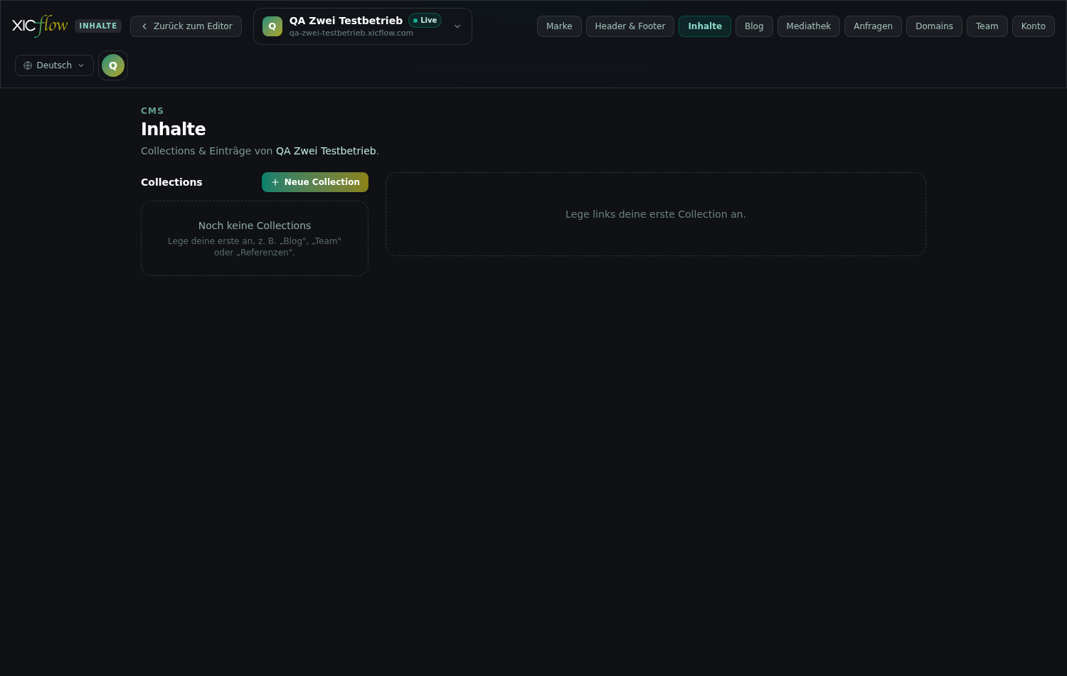
A “collection” is a set of similar data records. You define once which fields a record has and then fill in as many entries as you like.
The header of the area marks it as “CMS” and states “Collections & entries” of the selected website below. The collections are listed on the left, the entries of the selected collection on the right. Typical examples are references, team profiles or a menu: anything that repeats in the same shape.
Below each name in the left-hand list you see how many entries and how many fields the collection has. As long as nothing exists, the left column says “No collections yet” and suggests a first one — “Blog”, “Team” or “References”, for instance; on the right you are asked to select a collection on the left. A collection without any fields shows up as “No fields”.
Click “New collection” at the top left.
Enter the collective term under “Name (plural)” and the wording for a single record under “Singular name”.
For example References and Reference. The “Key” field fills in automatically.
Under “Slug field” choose the field the web address of an entry is built from, usually the title.
With “— none (auto) —” XICflow takes care of it automatically.
Decide on “Create detail pages per entry”.
When switched on, every published entry gets its own subpage. Leave it off if the entries should only appear as a list.
Under “Fields” use “Add field” to create the input fields: a “Label” and a “Type” for each one.
The “Key” is derived automatically. “Required field” makes an entry mandatory.
Order the fields with “Move up” and “Move down”; remove a field you no longer need with “Remove field”.
Click “Save”.
| Setting | Effect | Possible values | Default |
|---|---|---|---|
| Name (plural) | Name of the collection in the list and heading above the output on the page | Text, 120 characters at most | Required |
| Singular name | Wording of the button for a new record | Text, 120 characters at most | empty — the button then reads “New entry” |
| Key | Technical name a block uses to find the collection | Lower-case letters, digits, hyphen, underscore | derived from the name; a number is appended on collision |
| Slug field | Field the web address of an entry is built from | one of the fields you created, or “— none (auto) —” | the “Title” field every new collection starts with |
| Create detail pages per entry | Creates a subpage per entry when you publish; cards in lists link to it | on or off | off |
| Fields | The input fields an entry consists of | up to 100 fields | one required “Title” field of type Text |
Every field in the “Fields” list carries the same four details; the options only appear for the type “Select”. The label field shows “e.g. Title” as an example while it is empty.
| Setting | Effect | Possible values | Default |
|---|---|---|---|
| Label | Wording of the field in the entry dialog | Text, 190 characters at most | empty |
| Key | Technical name of the field; must be unique within the collection | Lower-case letters and underscores | derived from the label |
| Type | Kind of input and of the later output | nine field types | Text |
| Required field | The entry cannot be saved without a value | on or off | off |
| Options (comma-separated) | The available choices; only shown for the type “Select” | up to 200 values, 190 characters each at most | empty |
If you delete a collection with the bin icon in the edit dialog, XICflow asks “Delete collection … with all … entries?” — the entries are lost along with it.
Few, clear fields work best
Every field shows up in every entry later on. Start with the details you reliably have for each record and add more later; existing entries keep their values.
The “Type” of a field decides two things: how you enter the value and how it later appears on a detail page.
| Field type | Input in the entry | Output on a detail page |
|---|---|---|
| Text | Single-line input | The first text field becomes the heading; further text fields appear in the fact list |
| Text area | Multi-line field (three rows) | Subheading with the label, followed by the text as a paragraph |
| Rich text | Multi-line field (six rows) | Subheading with the label, followed by the text as a paragraph |
| Number | Number field | Row in the fact list |
| Yes/No | Checkbox | Row in the fact list, as “Ja” or “Nein” |
| Image | Address field with a preview below it | Image below the heading; the first image field also serves as the card thumbnail and as the sharing image |
| URL | Address field for https://… | Button labelled with the label of the field |
| Date | Date field | Row in the fact list |
| Select | Drop-down list of the options, initially “— please select —” | Row in the fact list |
For the type “Select” you also enter the possible values under “Options (comma-separated)”. For the type “Image” you paste the address of a file — copy it in the media library with a click on the image; the placeholder in the field shows both forms: “/storage/…” or “https://…”.
You can still change the field type later on. Values that were already saved are kept, but they do not always match the new kind of input — check a few entries afterwards.
Once the structure is in place it is all about filling it: create entries, set the status, change or delete them later.
Select the collection on the left.
Click “New entry” at the top right.
If you set a singular name, the button carries it: “Reference” becomes “New Reference”.
Fill in the fields. Required fields are marked with an asterisk.
Under “Status” choose between “Draft” and “Published”.
Only published entries appear on the website later on.
The “Slug” field is optional; if you leave it empty the address is created automatically.
Click “Save”.
| Setting | Effect | Possible values | Default |
|---|---|---|---|
| Status | Decides whether the entry goes onto the website when you publish | “Draft” or “Published” | Draft |
| Slug | Last part of the address when the collection creates detail pages | Lower-case letters, digits and hyphens, 190 characters at most | empty = derived from the slug field; a number is appended on collision |
| Language | Sets which language version of the fields you are filling in | the languages of your website | the base language |
To change an entry, click it or use the pencil icon “Edit”; the bin icon deletes it after the confirmation “Delete this entry?”. Close the dialog with “Cancel”, the cross or the Escape key — anything unsaved is discarded.
If your website is multilingual, language switches appear in the entry dialog. The source language is marked “Base”; fields you leave empty in another language inherit its value. Required fields are only checked in the base language.
A collection without entries shows “No entries yet” and asks you to create the first one for it. After that, the list shows each entry with its title, its state (“Draft” or “Published”) and, if set, its slug. Entries without a usable title appear as “Untitled”.
Description: With roasted seeds and herb oil.
Course: Starter
Description: Seasonal vegetables from the oven, served with a herb dip.
Course: Main course
Description: Served warm, with vanilla sauce.
Course: Dessert
Entries you created are not visible yet. They reach the page through the “CMS list” block — and, if you want, additionally as their own detail pages.
In the editor, open the page the entries should appear on.
Add the “CMS list” block.
On the right, choose the collection you want under “Collection”.
The number of entries is shown after each name. If there is no collection yet, the note links straight to the content area.
Set “Display”, “Columns” and “Maximum count (0 = all)”.
| Setting | Effect | Possible values | Default |
|---|---|---|---|
| Collection | Which collection is listed | Drop-down list of this website’s collections | “— select —” |
| Heading (optional) | Title above the list | Text | empty — the name of the collection is used |
| Display | Cards side by side or entries below each other | “Raster” (grid) or “Liste” (list) | Grid |
| Columns | Cards per row; only with the grid display | 2, 3 or 4 | 3 |
| Maximum count (0 = all) | Limits how many entries are shown | whole number; 0 = all | 0 |
Only published entries are listed, in the order they have in the management view. The card shows the first image field as its thumbnail, the first text field as its title and the remaining fields below.
When “Create detail pages per entry” is switched on, every card links to the entry’s subpage. Its address is made up of the collection key and the entry slug. Title and description of that page are created automatically: the title from the title field, the description from the first longer text field, shortened to about 155 characters.
Changes need a publish
New and changed entries first only exist in the management view. They appear on the live website as soon as you publish it again in the editor.
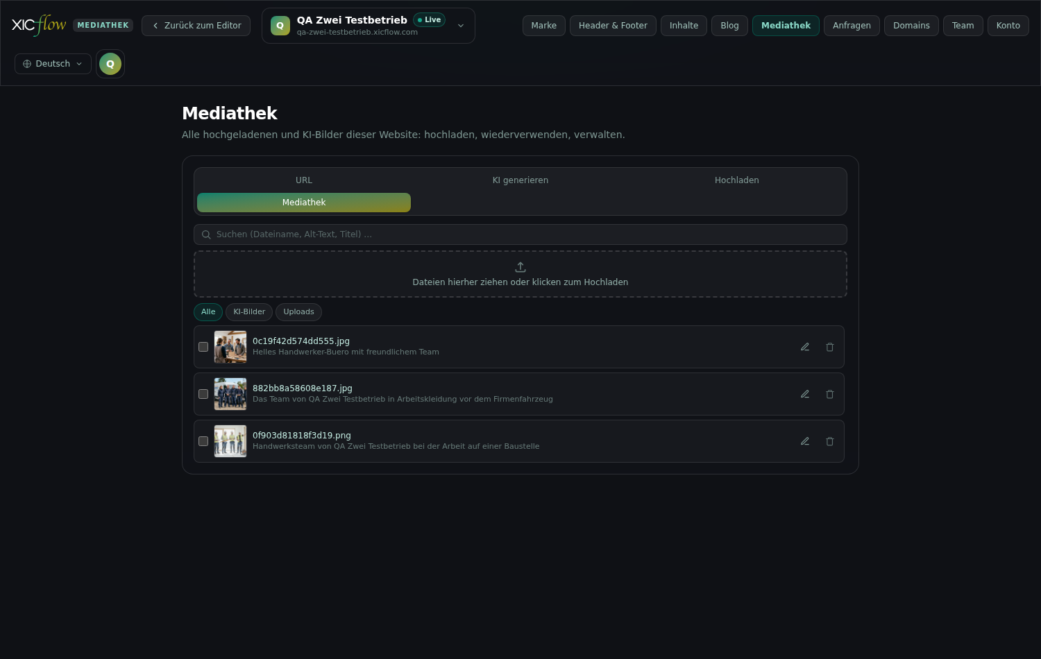
The media library collects all uploaded and AI-generated images of a website. The tabs “URL”, “Generate with AI”, “Upload” and “Media library” switch between the sources.
You reach the media library in two places: as its own area from the top bar, and in the editor at every image field of a block. The files and the four tabs are the same; only clicking an image differs — in the “Media” area it copies the address, in the editor it inserts the image.
| Tab | What it is for |
|---|---|
| URL | Paste an existing image address — this also works without signing in |
| Generate with AI | Have a new image created from a description |
| Upload | Pick a single image file from your computer |
| Media library | Search existing files, upload several, maintain alt text, delete |
Switch to the “Upload” tab and click “Choose file”.
While the file is transferred you see “Uploading…”. This tab takes a single image file.
For several files at once use the dashed area “Drag files here or click to upload” on the “Media library” tab.
Only through this area does XICflow accept SVG, PDF and video as well.
| Kind | Formats | Limit per file |
|---|---|---|
| Image | JPEG, PNG, WebP, GIF | 8 MB and 40 megapixels at most |
| Vector graphic | SVG | 8 MB; active content is stripped from the file during upload |
| Document | 25 MB | |
| Video | MP4, WebM | 200 MB |
After the upload something else happens in the background: every raster image gets web versions in four widths (400, 800, 1,200 and 1,600 pixels) as AVIF and WebP, so your page only loads as much data as it needs on each device. Camera data such as GPS coordinates is removed from the original. SVG files are stripped of active content, PDF and video stay untouched.
How much storage you have in total depends on your plan. Once it is full, XICflow refuses new uploads and suggests changing the plan or deleting media you no longer need.
If you have no suitable photo, describe what should be visible on the “Generate with AI” tab. The result lands in the same media library as an AI image.
Switch to the “Generate with AI” tab.
Under “Describe the image” write what the image should show.
The example in the field shows the direction: “e.g. bright office with a team at a whiteboard”. Up to 2,000 characters are possible.
Under “Purpose” choose what the image is meant for.
The purpose determines format and composition: “Determines format and composition — e.g. hero with a calm area for the headline.”
Click “Generate”; while it runs the button reads “Generating…”.
| Purpose | Image format | Composition |
|---|---|---|
| Hero | 16:9 | Wide establishing shot with a calm area for the headline |
| Card | 4:3 | A single subject, centred, still readable at small size |
| Gallery | 3:2 | Balanced composition that survives a square crop |
| Portrait | 3:4 | Vertical format, subject in the upper part |
| Banner | 21:9 | Very wide band with generous space on both sides |
Your description stays at the centre; your brand colours and fonts are added automatically — the note below the buttons says so: “Your brand colours and style are added automatically.” It is also predefined what an image must not contain: no text, no recognisable faces of real people and no third-party brands or logos.
Images are not evidence
A generated image shows a scene, not a real before-and-after and not real members of staff. For references, team portraits and product photos, use your own pictures.
The longer a website lives, the fuller its media library gets. Search, filters and multiple selection keep it manageable.
The search field “Search (filename, alt text, title) …” helps you find single files again; it searches the whole library, not just the list on screen. The buttons under “Source” narrow things down to “All”, “AI images” or “Uploads”; if different kinds of files exist, “Media type” with “Images”, “Videos”, “Documents” and “Files” appears as well. Both are view filters only — nothing is deleted by them.
The list shows the 200 most recent files. If you are after an older one, searching gets you there faster than scrolling. Files that are not images carry a marker: “PDF”, “Video” or “File”.
Clicking an image copies its address to the clipboard, confirmed with “Image URL copied to clipboard.”. You can paste that address into an image field of a collection, for instance. In the editor the same click is called “Use this image” and puts the image straight into the block.
To remove an image, click the bin icon “Delete image” on it. If the file is still in use, XICflow asks first and says in how many places. For several files tick the checkboxes; “… selected” then appears above the list, “Delete selection” removes them together and “Clear selection” cancels. What is counted are the blocks and sections of your pages, the sharing image of a page and the files of your brand.
Deleting is final
Deleted files cannot be restored; they disappear together with all derived sizes. If an image is still in use, replace it in the editor first, otherwise empty image slots stay behind.
Alternative text describes what an image shows. Screen readers read it out, and it appears when an image fails to load.
Images without alternative text are marked “No alt text” in the media library, which makes a useful to-do list.
Click the pencil icon “Edit alt text & title” on the image you want.
Under “Alt text (accessibility)” describe what the image shows.
Under “Title (tooltip)” you can add a title as well; that field is optional.
If you like, click “AI: suggest alt text & title”.
While it runs you see “AI is analysing the image…”. Read the suggestion and adjust it.
Click “Save”, or discard your changes with “Cancel”.
What belongs in it?
Describe the content briefly rather than the file: “Technician checking a heating system” says more than “Photo 3”. Purely decorative images do not need a long description.
To show several images at once, use the “Gallery” block. It offers three arrangements and picks up the alternative text you maintained in the media library.
| Setting | Effect | Possible values | Default |
|---|---|---|---|
| Layout | Arrangement of the images | “Raster” (grid), “Masonry” or “Mosaik” (mosaic) | Grid |
| Columns (2 | 3 | 4) | Images per row | 2, 3 or 4 | 3 |
| Tile size | Size of a single tile; only in the mosaic layout | 1x1, 2x1, 1x2, 2x2 | 1x1 |
| Image | Source of the tile | an address from the media library or any other image address | empty |
| Alt text | Description of the image for screen readers | Text | empty |
| Caption | Visible text below the image | Text | empty |
| Category | Groups the image; as soon as one is set, a filter bar appears | Text | empty |
If you give the images categories, a filter bar appears above the gallery; without categories there is none. Tiles without an image are not rendered — an empty field therefore leaves no empty box behind.


The “Blog” area — marked “Editorial” in the header, with “Blog posts” of the selected website below it — keeps all posts in one place: have the AI write them, revise them in the editor, and set status and date in the list.
In the “Create post with AI” panel, click “Suggest topics”.
You get five suggestions with an angle, a category and tags. “New suggestions” fetches more of them.
Clicking a suggestion transfers topic, category and tags into the fields below.
Alternatively, write what the post should be about yourself under “Topic”.
Add “Category” and “Tags” if you want: comma-separated, six at most.
Under “Status” choose between “Draft”, “Scheduled” and “Published”.
Set the date under “Date”. For the status “Scheduled” a date is mandatory.
Click “Create post”.
The progress is shown, for example “The AI is writing the post…”.
| Setting | Effect | Possible values | Default |
|---|---|---|---|
| Topic | What the post is written about | Text, 3 to 200 characters | empty — required |
| Category | Groups the post and drives the filter bar of the blog list | Text, 60 characters at most | empty |
| Tags | Keywords for the post | comma-separated, six at most, 40 characters each at most | empty |
| Status | Sets whether the post is included when publishing | “Draft”, “Scheduled”, “Published” | Draft |
| Date | Date of the post | a date, today or later; mandatory for “Scheduled” | empty |
While the fields are empty they show examples: “e.g. Five signs your heating needs servicing” for the topic, “e.g. Guides” for the category and “servicing, heating, cost” for the tags.
While it works, the panel says where the job stands: first “Job queued…”, then “The AI is writing the post…” with a percentage; the button itself reads “Creating…” all the while. The topic suggestions announce themselves with “Loading suggestions…”.
Once the post is finished it is marked “New” in the list. Read it through afterwards: it is a draft, not a checked publication.
If “Quota used up” appears
Then your AI quota for the current period is exhausted. “Later” closes the notice and you keep writing posts yourself in the editor; “View plans” takes you to your plan.
The “Posts” list is the working surface for everything that is already written.
In each row you can change “Status”, “Date” and “Category” directly; the change is saved immediately and confirmed with “Change saved.”. The pencil icon “Open in editor” lets you edit the text, images and blocks of the post like on any other page. The bin icon “Delete” removes a post after the confirmation “Delete this post?” and reports back with “Post deleted.”.
The list is sorted by date with the most recent post at the top; the number of posts is shown above it. Below the title you see the address of the post. Posts without a title appear as “Untitled”. If nothing has been written yet, it says “No posts yet” with the button “Create first post”, which jumps to the topic field.
| Status | What it does |
|---|---|
| Draft | The post stays in the management view and is not included when you publish. |
| Scheduled | Needs a date. While the date lies in the future the post is left out; from that date on it is included the next time you publish. |
| Published | The post goes onto the website the next time you publish. |
| Archived | Only appears if a post already carries it. Such a post is not delivered and the status is not offered for new posts. |
The date is more than a note: it sorts the list, appears on the card in the blog and, with the status “Scheduled”, decides from when the post is included at all. The category later drives the filter bar of the blog list — keep the spelling consistent, otherwise you end up with two filters for the same thing.
Everything else — text, images, blocks, language versions and the details for search engines — is edited in the editor. A post is a page like any other there.
Visible only after publishing
Above the list you find the most important note: “New and edited posts only appear on the live website once you publish the website again.” Until then the previous state stays online, and the same is true for entries from the “Content” area.
Published posts get an overview, their own addresses and a feed to subscribe to. You bring them onto any page with the “Blog list” block.
| Setting | Effect | Possible values | Default |
|---|---|---|---|
| Title | Heading above the cards | Text | “Aus dem Blog” |
| Subtitle | Line below the heading | Text | empty |
| Posts per page | Number of cards per page; beyond that pagination appears | whole number | 9 |
| Columns (2 | 3 | 4) | Cards per row | 2, 3 or 4 | 3 |
| Category filter (true / empty) | Shows the filter bar above the cards | true or empty | true |
Short forms, understandable error messages, accessible operation and spam protection without hurdles: how website visits turn into real inquiries, and what data protection asks for along the way.
JSON-LD per page type: what structured data achieves for companies, services, FAQ entries, articles and reviews, which details have to line up and how to validate the result.
Which details a business website needs in Germany: provider identification under the DDG, entries per legal form, privacy policy and withdrawal notice.
The messages that come up most often in these three areas, and what is behind each of them.