On this page
Editor and pages
The editor is where your website takes shape: you create pages, fill them with blocks and see the result straight away. Everything you change is saved automatically — but it only reaches your public website once you click "Publish" in the top right.
How the editor is laid out
The editor is split into three columns: pages and the block catalogue on the left, the preview in the middle, the settings on the right.
- Left: Under "Pages" you find every page of the website, below that "Insert templates", "My templates", the "Blocks" catalogue and, at the bottom, the "Structure" list with the blocks of the open page.
- Middle: The preview. It shows the page the way visitors will see it and can be edited directly.
- Right: The inspector with the tabs "Properties" for the settings of the selected block and "AI" for the assistant.
Above them sits the header with the website switcher, the page title and the buttons for undo, versions, save state and publishing. The next section takes it apart piece by piece.
On phones and tablets the side columns are collapsed; the bar along the bottom edge opens them with "Structure" and "Properties". Only one of the two is ever open; a click on the dimmed area next to it or the Escape key closes it again. While a block is selected, "Properties" carries a small dot.
The browser tab title follows what you are working on: page title, name of the website and XICflow, separated by middle dots. A page without a title appears there as "Untitled".
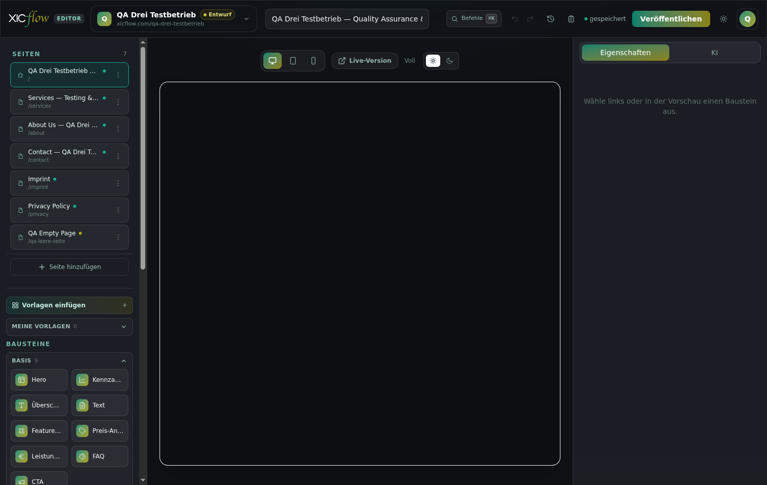
The header
The header holds everything that applies to the entire website or the entire page — read from left to right.
- Website switcher
- Shows the initial, the name and the state of the open website ("Live", "Draft" or "Archived") and its address below. A click opens the "Your sites" list.
- Page title
- The input field holding the title of the open page.
- Commands
- Opens the command bar; the ⌘K shortcut sits next to it. The button is hidden on narrow screens, the shortcut works regardless.
- Undo and Redo
- The two arrows. They stay greyed out while there is nothing to take back or to restore.
- Version history
- The clock icon; opens the saved states of the website.
- Activity
- The clipboard icon; opens the "who did what and when" history.
- Save indicator
- Shows "saved" or — if something is stuck — "Not saved" with "Retry".
- Publish
- Starts publishing. While it runs it reads "Publishing…", afterwards "Published" together with the address of the website.
- App theme light/dark
- Switches the editor’s own interface ("Switch to dark theme" or "Switch to light theme"). The look of your website is not affected.
- Account
- The circle on the far right with the other areas and "Log out".
Without a selected website, "Publish", "Version history" and "Activity" are disabled — they always refer to one particular website.
If publishing fails, the server’s error message appears in the same place, or "Publishing failed" as a fallback. What exactly happens during publishing is covered in the chapter "Publishing and your own domain".
Creating, renaming, ordering and deleting pages
Every website consists of pages and posts. You create both in the left column and order them there as well.
-
Click "Add page" at the bottom of the left column.
-
Choose the type: "Page" or "Post".
"Page" is the usual choice — a subpage such as "About" or "Contact". "Post" is a blog post and is filed below "/blog/".
-
Type a title into the field ("Page title…" or "Post title…").
-
Click "Create". "Cancel" discards your entry.
The new page opens right away, and its address is derived from the title automatically.
What the list shows
Above the list sits "Pages" with the number of pages next to it. Every row shows an icon — a house for the home page, a sheet otherwise —, the title, the marker "Post" for blog posts, a coloured dot for the status ("Published" or "Draft") and the address of the page below. If a page has no title yet, its address or simply "Page" stands in for it. While nothing exists yet it reads "No pages yet."; grey placeholders appear while loading.
New pages start as drafts — you can tell by the small dot next to the title, labelled "Draft" or "Published".
Renaming
Open the page and change the "Page title" field in the header. The new title is saved automatically a moment later; the address of the page stays the same.
Ordering, home page, draft and deleting
Every row of the page list has a three-dot menu on the right. Clicking it opens the actions:
- "Move up" and "Move down" change the order in the list.
- "Publish" and "Set to draft" switch the status. Pages in draft are left out when you publish.
- "SEO & meta" opens the search engine settings for this page.
- "Set as home" turns the page into the home page. There is always exactly one.
- "Delete" removes the page, after confirming "Delete page?" with "Delete" or "Cancel".
The order in this list is the order of the pages of your website. If you delete the page that is currently open, the editor switches to the home page, or to the first remaining page, by itself.
Subpages
The address of a page is derived from its title. Posts are filed below "/blog/", all other pages sit directly below the main address. If the path already exists, the editor appends a number. Deeper nesting — pages below other pages — is not something the editor sets up on its own; where a page appears in the menu is decided in the "Header & Footer" area.
The home page is protected
The home page can neither be deleted ("The home page cannot be deleted") nor set to draft. Make another page the home page first, using "Set as home".
Adding, moving and removing blocks
A page is made of blocks stacked one below the other — for example "Hero", "Feature grid" or "Contact form".
-
Open a category under "Blocks" on the left.
-
Click the block you want.
It is appended at the bottom of the page and selected immediately.
-
Edit it in the "Properties" tab on the right.
In the "Blocks" catalogue they are sorted into categories; the number next to the name says how many blocks the category holds. "Basics" is open when the editor starts, the other categories open on demand.
| Category | Count | Blocks |
|---|---|---|
| Basics | 9 | Hero, Metrics, Heading, Text, Feature grid, Price anchor, Leistungsliste, FAQ, CTA |
| Text & structure | 10 | Intro, Quote, Highlight, Key takeaways, List, Callout, Divider, Code, Terminal, Image |
| Grids & cards | 22 | Columns, Icon cards, Testimonials, Testimonial slider, Fact band, Trust badges, Logo wall, Team, Opening hours, Social links, Steps, Stat cards, Accordion, Disclosure, Tabs, Timeline, Process steps, Metric band, Mini cases, Split feature, Comparison cards, Feature tabs |
| Conversion & CTA | 12 | CTA band, CTA split, Announcement, Countdown, Button, Button group, Pricing table, Pricing toggle, Phone band, Contact form, Form, Newsletter |
| Media & showcase | 8 | Gallery, Video, Downloads, Mockup, Service area, AI assistant demo, Vorher-Nachher, Bild mit Punkten |
| Content (CMS) | 1 | CMS list |
| Blog & context | 6 | Blog list, Table of contents, Post mockup, Related posts, Related links, Comparison table |
What each individual block does and which settings it brings along is covered in its own chapter about blocks. This section is only about handling them. Three blocks have no English label yet and appear in German: "Leistungsliste", "Vorher-Nachher" and "Bild mit Punkten".
Our services
Consulting
One or two sentences describing the offer in plain language.
Delivery
The second entry of the same row — similar lengths look calmest.
Support
Three cards fill the row completely, which is why that is the default.
While the page is still empty, the preview shows "No blocks yet" with the note "Add a block on the left." and the buttons "Insert templates" and "Create with AI".
Moving, duplicating, removing
The "Structure" list shows every block of the page in its order. Clicking an entry selects it and reveals it in the preview; next to it sit the buttons for "move up", "move down", duplicating and "delete". You can also grab the entries with the mouse and drag them into place — the hint "drag to sort" is a reminder of that.
A duplicate is inserted directly below the original and is selected afterwards. While the list is empty it reads "No blocks yet."
The same works directly in the preview: a single click selects a block, after which a small bar appears on it with "Move up", "Move down", "Duplicate", "Settings" and "Delete".
Placing blocks side by side
For two or more blocks next to each other there is the "Columns" block from the "Grids & cards" category. It takes other blocks into its cells; how you fill it is described below under "The inspector on the right".
Editing text right in the preview
A double click on a text in the preview makes it editable on the spot. A second bar appears with "Bold", "Italic", "Accent" and "Link" — for "Link" you enter the address and confirm with "Apply".
Keyboard while editing in the preview
Enter ends the editing, Shift+Enter inserts a line break, Escape discards the change.
The inspector on the right
The right column always belongs to exactly one block. It has two tabs: "Properties" and "AI".
Without a selection it reads "Select a block on the left or in the preview." As soon as a block is selected, the top line names it and its fields follow below. You switch between the two tabs with the mouse or with the left and right arrow keys. What happens in the "AI" tab is covered in the chapter "Working with the AI".
Fields
Depending on the block you get single-line fields, multi-line text areas, switches, option pills and lists of cards. In lists you edit every card individually; the small buttons on a card are called "Move up", "Move down" and "Duplicate". Images are picked from the image source — more on that in the chapter "Content, media library and blog".
Blocks without text of their own say so instead of showing an empty form: the divider states "A divider has no editable content — adjust spacing, line and style below.", the table of contents "The table of contents is generated automatically from the page headings.", the post mockup "The preview graphic is generated automatically — nothing to set here." and everything else "This block has no text fields — adjust layout, spacing and style below."
Layout, style and pro mode
Below the fields the same sections always follow: "Layout" with the display variants of the block (if it has any), "Style" for spacing, alignment and tint, "Flow Design · Pro" for gradients, patterns and effects, plus the switch "Pro mode · every CSS detail" which shows "on" or "off" on the right.
While pro mode is on, the selector "Applies to" appears above it. It decides what the settings below refer to: the "Whole block" or a single element inside it — "Card", "Image", "Icon", "Title", "Text", "Button" or "Extra". Which elements are offered depends on the block. The preview width plays its part here as well: desktop, tablet and mobile can be set separately.
Blocks with a structure of their own
Four blocks bring their own controls to the inspector:
- Columns
- At the top you pick the split under "Layout", below it the "Spacing" between "Tight", "Normal" and "Wide". Every cell gets its own box "Column 1", "Column 2" and so on with the buttons "Narrower column" and "Wider column" (the number in between is the "Width (fr)", the size ratio of the columns) plus "Remove column". "+ Block" fills a cell, "+ Column" adds another column — up to six. Clicking a block inside a cell unfolds its simple fields; if it has none it reads "No simple fields." or "For full editing, click the block directly in the preview." While a block inside a column is selected, the inspector reports "In row · column 2" at the top; "To the row" jumps back to the surrounding columns block.
- Comparison table
- Under "Column headers" you enter the headings, "+ Column" adds another one (up to six). The "Rows" follow below: "+ Row" creates one, the arrows sort them, the cross deletes them. Without content it reads "No rows yet — add via "+ Row"." The note at the end explains the notation: values such as "included" or "—" render as a check mark or dash in the preview, any other text stays text, and the first column is always the feature column.
- Form
- Under "Form fields", "+ Field" creates a field. Every field has a "Field label", a "Field type" — "Text", "Email", "Phone", "Text area", "Number", "Dropdown", "Checkbox" or "Consent" —, the "Required" switch and, except for checkbox and consent, a "Placeholder (optional)". The "Dropdown" type adds the field "Options, comma-separated". Without fields it reads "No fields yet — add via "+ Field"."
- CMS list
- Under "Collection" you pick the content collection to show ("— select —"). If there is none yet it reads "No collections yet. Create one under Content (CMS)." Below that follow "Heading (optional)" — empty falls back to the name of the collection —, "Display" with "Grid" or "List", the "Columns" 2, 3 or 4 for the grid and "Maximum count (0 = all)".
Templates
Templates are ready-made sets of blocks; you can change them freely afterwards.
-
Click "Insert templates" on the left.
-
Pick a category at the top: "Starting points", "Premium pages", "Industries", "Page types" or "Sections".
-
Click the card you want ("Apply").
Every card shows a name, a description and the number of blocks it contains.
| Category | Contents |
|---|---|
| Starting points | Full-page foundations to get going fast. |
| Premium pages | High-quality, full-page templates for SaaS, agency, portfolio, event and more. |
| Industries | Ready-made landing pages per industry — apply and adjust. |
| Page types | Single pages like About, Services, Pricing, Contact. |
| Sections | Small building blocks to drop in — hero, features, pricing, FAQ. |
Above the category selection it reads "Quick start · Templates" with the sentence "Pick a template as a starting point or drop in a section." Below the name and description of every card sit small markers naming the blocks it contains — for example "Hero", "Metrics", "Heading", "Intro", "Text", "Features", "Comparison", "Note", "Price", "FAQ", "Form" and "CTA".
The blocks of the template are appended to whatever is already on the page, so existing content is not lost. If the result does not fit, "Undo" takes it back. You close the window with the cross, with Escape or by clicking the area next to it.
- 1
Enquiry
You briefly describe what you need.
- 2
Appointment
We agree on a date and clear up open questions.
- 3
Delivery
The work starts and you stay in the loop.
My templates
To keep a block of your own as a template, select it, open "My templates" on the left and click "Save current block". Without a selection the button stays inactive ("Select a block first"). A prompt "Template name:" follows, pre-filled with the name of the block. From then on you can add the template again at any time with "Insert" or remove it with "Delete template". While nothing is saved it reads "No templates yet. Select a block and save above."
An inserted template ends up at the bottom of the page and is selected afterwards. Your own templates apply to all of your websites, but they are stored in the browser — on another device or in another browser they are not available.
Preview on desktop, tablet and mobile
The preview shows not only the content but also how it behaves on different screens.
Above the preview sits the group "Preview width" with the icons "Desktop", "Tablet" and "Mobile"; the matching width stands next to it. Always check longer pages in "Mobile" as well.
| Button | Width | What for |
|---|---|---|
| Desktop | Full | The preview uses the entire available width. |
| Tablet | 820 px | Medium screens. |
| Mobile | 390 px | Phone width; many blocks rearrange themselves here. |
Under "Preview colour scheme" you switch between "Preview light" and "Preview dark" — that shows how the page looks for visitors whose system is set to a dark theme. This is different from "App theme light/dark" in the header, which only changes the editor itself.
Once the website is published, "Live version" opens the real page in a new browser tab. If several languages are active, the "Editing language" appears to the left of it — it decides which language version you are currently editing.
Selecting and editing
The preview is not an image but the page itself — rendered with the very blocks that are delivered later. A click selects a block and marks it in the "Structure" list at the same time; the other way round, a click in the list scrolls the preview to the matching spot. A double click on a text field starts inline editing; for blocks without editable text the cursor jumps into the first field of the inspector instead. On phones and tablets the right column opens automatically while doing so.
Command bar and keyboard shortcuts
The command bar gathers everything you need often in one place — one keystroke away.
Ctrl+K or Cmd+K opens the command bar, and the same shortcut closes it again; alternatively click "Commands" in the header. The focus goes straight into the search field "Search command or block…". Typing filters the list, the arrow keys move the selection, Enter runs the entry. If the search finds nothing it reads "No match for …". A line along the bottom is a reminder of the controls: "navigate" and "run".
The results are sorted into groups:
| Group | What it contains |
|---|---|
| Actions | "Publish", "Version history", "Activity", "Undo" (⌘Z), "Redo" (⌘⇧Z), "Insert templates", "Preview Desktop", "Preview Tablet", "Preview Mobile" (the current one is marked "active"), "Toggle pro mode" ("on"/"off"), "SEO of this page" and "Open AI assistant" |
| Blocks | One entry "Insert block: …" for every block in the catalogue. It appends the block at the bottom of the page. |
| Current blocks | One entry "Block: …" for every block on the open page. It selects the block and scrolls the preview to it. |
| Pages | "Go to page: …" for every page of the website, with its address on the right. |
| Navigation | "Brand & design", "Header & Footer", "Custom domains", "Requests", "Content (CMS)" and "Account & billing". Operators also see "Operator admin". |
"Undo" and "Redo" only appear while there is something to take back or to repeat. The entry "Redo" does the same as "Redo" in the header.
All keyboard shortcuts
| Shortcut | Effect | Where |
|---|---|---|
| Ctrl+K / Cmd+K | Open and close the command bar | anywhere in the editor |
| Ctrl+Z / Cmd+Z | Undo | anywhere in the editor |
| Ctrl+Shift+Z / Cmd+Shift+Z / Ctrl+Y | Redo | anywhere in the editor |
| Escape | Closes the command bar, the templates window, SEO, version history, activity and the side columns on phones and tablets | anywhere in the editor |
| Enter | Ends the editing and keeps the text | inline editing in the preview |
| Shift+Enter | Inserts a line break | inline editing in the preview |
| Escape | Discards the change | inline editing in the preview |
| Arrow up / Arrow down | Moves the selection in the result list | command bar |
| Home / End | Jumps to the first or last result | command bar |
| Enter | Runs the highlighted command | command bar |
| Arrow left / Arrow right | Switches between "Properties" and "AI" | inspector tabs |
| Tab | The focus stays inside the open window until you close it | Templates, SEO & meta, version history, activity, command bar |
Undo, redo and version history
Two arrows in the header cover the last step; for bigger jumps there is the version history.
"Undo" (Ctrl+Z or Cmd+Z) and "Redo" (Ctrl+Shift+Z or Cmd+Shift+Z) sit in the header. The editor remembers up to 50 steps of the running session; fast typing counts as a single step.
Those steps only apply to the open page and only while the tab stays open. Applying a template and accepting an AI proposal also create such a point, so a single click takes them back.
"Version history" (the clock icon in the header) collects "Publish states, AI changes & checkpoints" for the entire website:
-
Click "Version history" in the header.
-
Under "Save current state", enter a "Label (optional)" and click "Checkpoint".
That keeps the current state safe before you rebuild something larger.
-
Click "Restore" on the version you want and confirm with "Yes, restore".
Every entry names the version number, the label (without one of its own: "Snapshot"), date and time as well as who created it. Published states additionally carry the marker "published". If there is nothing yet it reads "No versions yet." with the note "Snapshots are created automatically when publishing and on AI changes. Save a checkpoint yourself anytime."
Before a restore, the current state is saved as an entry of its own automatically — so that step can be taken back as well. After a restore the editor reloads the website completely; that is expected. If something fails, the panel reports "The history could not be loaded.", "Checkpoint failed." or "Restore failed."
Activity: who did what and when
The activity history is the read-only story of your website — without any buttons that change something.
The clipboard icon in the header opens "Activity" with the subtitle "Who did what and when — traceability". Every entry names the action, date and time as well as the person; AI actions add the model that was used and the number of tokens spent, and failures add the server’s message.
| Entry | Meaning |
|---|---|
| Planning | The AI planned a structure for the website. |
| Website built | The AI generated pages and content. |
| Page generated | A single page was generated. |
| Block generated | A single block was generated. |
| Text generated | A text was written or rewritten. |
| Image generated | An image was generated. |
| SEO generated | Meta information was generated. |
| Translation | Content was carried over into another language. |
| Legal texts generated | The imprint and the privacy policy were generated. |
| Publication | The website was published. |
| Checkpoint saved | A state was saved by hand; the label follows behind it. |
If an action is still running or has failed, a small marker says so: "succeeded", "failed", "running", "waiting" or "queued". The footer is a reminder of what this panel is for: "Read-only history · Restore in version history". If nothing has happened yet it reads "No activity yet." with the note "AI actions, publishes and checkpoints appear here automatically."
SEO and meta information per page
What search engines and social networks show for a page is set in the "SEO & meta" panel — per page and per language.
-
Open "SEO & meta" from the three-dot menu of the page.
For the open page you can also use "SEO of this page" in the command bar.
-
Fill in the "Meta title" and the "Meta description".
The "Preview · Search result" box at the top shows straight away how the entry will look.
-
Click "Save" at the bottom and wait for "Saved".
This panel does not save automatically — without that click your entry is lost.
At the very top, the "Preview · Search result" box shows the address, headline and preview text the way a search result will look. As long as you have not entered an address of your own, it uses an example ("https://your-domain.com") with the path of your page; if the description is missing, the placeholder text explains what it is for. If your website runs several languages, the tabs below let you pick the language version; with a single language it simply reads "Language: Deutsch".
| Field | Effect | Limit |
|---|---|---|
| Meta title | The headline of the search result. If the field stays empty the page title is used — the note below names it. | counter up to 60 characters |
| Meta description | The preview text below the search result. | counter up to 155 characters |
| OG title | Headline when the page is shared on social networks. Empty = meta title, otherwise the page title. | — |
| OG description | Text when sharing. "Otherwise falls back to the meta description." | — |
| OG image (URL) | The preview image when sharing. Picked from the same image sources as in the inspector. | — |
| Robots | "Index (index, follow)", "noindex, follow" or "noindex, nofollow". Both noindex values keep the page out of search results. | default: Index |
| Canonical URL (override) | Enters a different original address. "Empty = automatic from domain + path." | — |
| Previous paths (301 redirect) | Old addresses that permanently redirect to this page. Renaming adds them automatically; manual entries help when moving from an old website. | 10 at most |
| JSON-LD (structured data) | Additional structured data. On the right it says "JSON ok" or "Not valid JSON"; both are saved, only valid JSON is delivered. | — |
The counters next to "Meta title" and "Meta description" change colour as you approach the limit, and more clearly once you exceed it. They are recommendations: a longer text can be saved as well, but search engines will shorten it. "Meta title", "Meta description" and the three OG fields apply per language, while "Robots", "Canonical URL", "Previous paths" and "JSON-LD" apply to the whole page.
Extra fields for blog posts
For a "Post" the "Blog post" section appears at the very top:
| Field | Meaning |
|---|---|
| Status | "Draft", "Scheduled" or "Published". |
| Date | The publication date of the post. |
| Category | Free text, for example "Guide". |
| Author | The name that is shown. |
| Tags | Keywords, separated by commas. |
| Reading time | The reading time in minutes that is shown. |
A date in the future together with the status "Scheduled" or "Published" releases the post automatically at that time; it then appears under "/blog/".
As long as no translation exists for a page, the panel says so: "No translations have been created for this page yet — meta/OG are edited per language once one exists."
This panel does not save on its own
Unlike the editor, "SEO & meta" only saves when you click. If you close the panel without "Save", your entries are gone. After saving, "Saved" appears in the bottom left, and "Saving failed." if something went wrong.
Languages: interface and website
Two things that are easy to mix up: the language XICflow speaks to you in, and the languages your website is published in.
Language of the interface
XICflow itself comes in German and English. You switch it in the header of the settings areas — for example under "Brand" — using the "Language" control with the entries "Deutsch" and "English". The choice applies to the whole interface immediately and is stored with your account, so it is the same on your next device.
Language versions of the website
Which languages your website runs and which one is the primary language is set in the "Brand" area. As soon as more than one language is active, the "Editing language" appears above the preview with a short code per language. It decides which version you are editing — the preview follows along.
In the primary language you edit the original text. In every further language the fields start out empty and show the primary text as a faint placeholder, so you can see what is still to be translated. What you enter replaces the placeholder in that language only; a field left empty falls back to the primary language when publishing. You can also have the AI translate the page — see the chapter "Working with the AI".
Meta information and OG fields are maintained per language as well, see the section on "SEO & meta". The "Page title" field in the header, by contrast, does not follow the editing language.
Switching website and the other areas
The editor always shows exactly one website. The switcher in the top left leads to the others — and to a new one.
Switching between websites
Clicking the switcher opens the "Your sites" list. Every row shows the name, the address and the state "Live", "Draft" or "Archived"; the current one carries a check mark. While the list loads it reads "Loading sites…", and without a website "No site" or "No site yet. Create your first."
When switching, the editor first saves the open page and then opens the home page of the other website. Escape or a click next to the list closes it.
Creating another website
"New site" opens the "Create new site" form in the same window:
- "Name" is required — without it the form reports "Please enter a name."
- "Domain (optional)": the address you want. It has to look like a domain, otherwise you get "Domain does not look valid (e.g. my-company.com)." The note below makes clear: "Can also be connected later in the "Flow Domains" area."
- "Existing website (optional)": enter the address of an existing site here and click "Load brand", and the AI reads name, tone and colours from it and carries them over to the new website. The response names what was applied, or "No suggestion found."
"Create site" creates it (showing "Creating…" while it runs), "Cancel" aborts. The new website opens right away.
The other areas
Everything that does not belong to a single page lives outside the editor. You reach it through the account menu, through the command bar or through the tab bar at the top of those areas: "Brand", "Header & Footer", "Content", "Blog", "Media", "Requests", "Domains", "Team" and "Account"; operators also see "Admin". To the left of them, "Back to editor" returns to the preview, and so does the logo.
Autosave
There is nothing to save by hand.
Shortly after you stop typing, the editor writes your changes away and the header shows "saved". The state is also saved first when you switch to another page, when you switch to another website, when you open another area and before every publish.
Two things are saved separately: the page title from the header and the blocks of the page. The "SEO & meta" panel is not part of that — there you click "Save" yourself.
If saving does not work
The header then shows "Not saved" next to "Retry". If you close the tab while something is still pending, the browser warns you first.
If a page could not be loaded in the first place, the editor deliberately switches saving off and reports "Page could not be loaded" — otherwise an empty state would overwrite the existing page. Reload before you carry on in that case.
If something goes wrong
The most common messages in the editor and what is behind them.
- The header shows "Not saved".
- Click "Retry" and keep the tab open until "saved" appears again.
- The preview area shows "Preview unavailable".
- Your changes are saved, only the rendering is missing. Click "Reload".
- A message says "Page could not be loaded".
- Reload the editor with "Reload" before you change anything — otherwise your changes will not be saved.
- Above the page list it says "Control plane unreachable — changes are not saved." next to "Offline".
- The connection to the server is missing. Wait a moment and reload the page; until then, changes to the page list stay in the browser only.
- The website switcher is marked "Demo".
- You are working in the click demo without an account ("Preview — not connected to the backend", and in the switcher "Preview mode — sites are kept locally until the backend is connected."). Nothing is stored and "Publish" stays disabled. Sign in to work on a real website.
- A message says "Sign in to access this area."
- The session has expired. Sign in again; when uploading images the message reads "Sign in to upload."
- The delete button of a page is greyed out.
- This is the home page ("The home page cannot be deleted"). Make another page the home page first, using "Set as home".
- A block shows no text fields on the right.
- Some blocks carry no text of their own, for example the "Divider" or the "Table of contents". The inspector says so; layout, spacing and style are still available below.
- The inspector says "This block type has no quick settings here."
- The editor does not know this block type — that happens with types the AI has just introduced. It renders normally on publish; you can change it through the AI chat.
- A contrast note appears after publishing.
- The message "… contrast note(s) — review in Brand & Design" points at colour pairs that are hard to read. The website is published; you change the colours in the "Brand" area.
Deleting always asks first: instead of a system dialogue, a confirmation unfolds right where you are — "Delete page?" for pages, "Really delete?" elsewhere — with the red "Delete" button next to it. Escape or a click beside it cancels without changing anything.