On this page
Brand and design
Under "Brand & design" you decide how your website looks and sounds as a whole: languages, colours, fonts, backgrounds, logo, favicon, tone of voice and an optional popup. In the editor each block adds the design system on top — gradients, patterns, effects, animations, symbols and the fine tuning in pro mode.
The "Brand & design" area
You reach the area from the dashboard via the "Brand" tab. At the top you select which website the settings apply to — they always concern that one website, not your whole account.
The sections are independent of one another: languages, logo, favicon, background, hero background, importing a brand from a website, brand voice, popup, fonts and brand colours. Almost every section has its own save button; only fonts and brand colours are stored together at the end.
The design system lives in three places: everything that applies to the whole website sits under "Brand & design". Anything that concerns a single block is set in the right-hand column of the editor. The header and footer have an area of their own.
| Area | Where to find it | What it defines |
|---|---|---|
| "Brand & design" | Dashboard, "Brand" tab | Languages, logo, favicon, background, hero background, brand import, brand voice, popup, fonts, brand colours |
| "Style" | Editor, right-hand column, below the block fields | Which screen sizes the block is visible on |
| "Flow Design · Pro" | Editor, right-hand column, directly below | Background (gradient, pattern, image), text colour, effects and animation of the block |
| "Pro mode · every CSS detail" | Editor, right-hand column, at the bottom | Spacing, border, shadow, typography, colours, size, position and custom CSS — per screen size |
| "Grid" and "Cards" | Editor, right-hand column, for blocks with a card list | Number of columns, order, visibility and tile size of the cards |
| "Header", "Footer", "Navigation" | Dashboard, "Header & footer" area | Logo, buttons and switches in the header, columns, legal texts and social links in the footer, menu items |
Save first, publish second
Changes are stored, but they only reach the website with the next publish. The note at the end of the area says: then hit "Publish" in the editor to make the changes live.
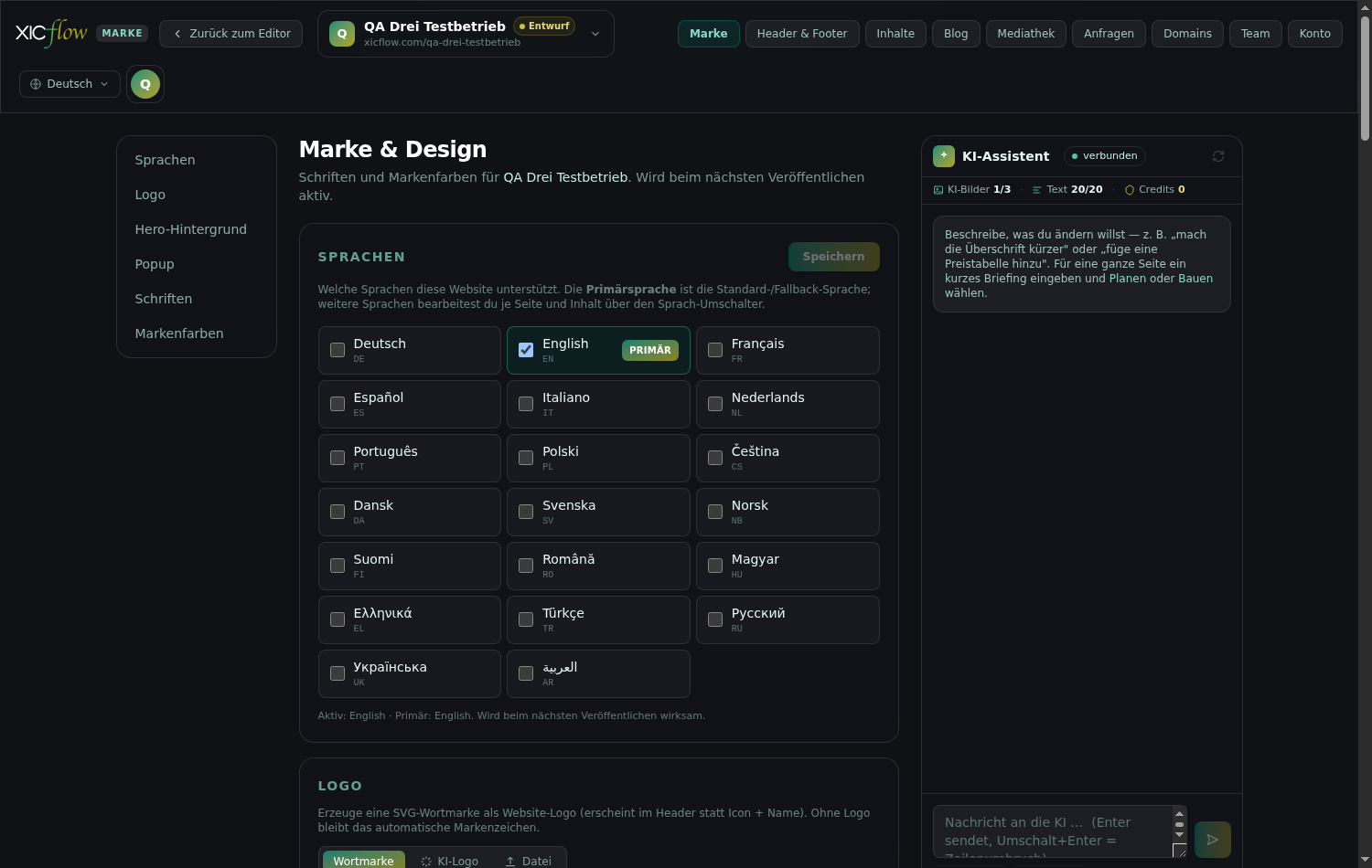
Languages
Here you decide which languages your website appears in. Exactly one of them is the primary language, which serves as default and fallback.
-
In the "Languages" section, tick every language your website should support.
-
Click "Primary" ("Set as primary language") on your main language.
The primary language is the default and the fallback: if a translation is missing, it steps in.
-
Click "Save" at the top right of the section.
The button then reads "Saved". Below the list a summary appears in the form "Active: … · Primary: …".
You then maintain the content of the additional languages in the editor via the language switch, page by page and item by item. Header, footer and navigation are also maintained separately per language.
The save button stays greyed out?
Then there is nothing to save. Tick or untick a language and "Save" becomes clickable again.
Colour system
Three roles carry the whole website: "Primary colour", "Accent colour" and "Surfaces / text". For each role you set one base colour for light mode and one for dark mode; the full scale is derived from them automatically.
You find the "Brand colours" section at the very bottom of the "Brand & design" area. Each base colour produces eleven shades from 50 (very light) to 950 (very dark): hue and saturation come from your colour, the lightness follows a fixed ramp. That is why buttons, borders, backgrounds and hover states stay consistent even when you change a single colour.
Primary colour
Buttons, links and highlights draw on this one.
Accent colour
Secondary colour for gradients and fine highlights.
Surfaces / text
Backgrounds, borders and body text.
| Setting | Effect | Possible values | Default |
|---|---|---|---|
| "Primary colour" | Buttons, links, highlights; the base colour represents shade 600 in the scale | HEX, RGB or HSL, with opacity | #004D43 |
| "Accent colour" | Secondary colour and gradients; represents shade 500 | HEX, RGB or HSL, with opacity | #ACA316 |
| "Surfaces / text" | Backgrounds, borders, body text; represents shade 500 | HEX, RGB or HSL, with opacity | #647169 |
| "Light" / "Dark" | One base colour per role for light mode and one for dark mode | two colour values per role | both identical |
| Scale 50–950 | Derived automatically from the base colour: hue and saturation stay, lightness follows a fixed ramp from very light (50) to very dark (950) | not editable directly | 11 shades per role |
| "= Light" | Resets the dark base colour to the light one | only appears when the two differ | — |
The colour picker
Clicking a colour chip opens the colour picker. It is the same everywhere — for brand colours, for the text colour of a block, for pattern colour, overlay and shadow. It can be operated entirely from the keyboard and closes with the Escape key.
| Control | Effect | Possible values | Default |
|---|---|---|---|
| Colour field | Saturation (horizontal) and brightness (vertical) | 0 to 100 percent each; arrow keys change by 1, with Shift by 10 | — |
| "Hue" | The hue angle on the colour wheel | 0 to 360; Home and End jump to the ends | — |
| "Opacity" | Alpha channel of the colour | 0 to 100 percent | 100 percent |
| "Output format" | The notation the value is stored in | HEX · RGB · HSL | HEX |
| "Aa on white" / "Aa on black" | Contrast ratio of the colour against white and against black | AAA from 7.0 · AA from 4.5 · from 3.0 large text only · below that "too low" | — |
| "Brand" | Fixed brand colours to click | #004D43, #ACA316, #00A88A, #0d0d10, #ffffff | — |
| "Recent" | Colours you used recently | up to 12 entries | empty |
| "Harmonies" | Suggestions derived from the current colour | 1× complementary, 2× analogous, 2× triad, 3× tetrad | — |
| "Pick a color from the screen" | Eyedropper: takes a colour from the screen | only shown in browsers that offer an eyedropper | — |
Keep an eye on contrast
The colour picker shows the contrast ratio against white and against black. Body text needs at least 4.5:1, large text 3:1. If a colour stays below that, use it as a surface rather than for type — or pick a darker base. The dark mode tint only changes saturation, never contrast.
If the dark base colour differs from the light one, a separate scale is stored for dark mode; if both are identical, no second scale is kept. Fonts and brand colours are saved together with the "Save" button at the end of the area.
Typefaces
You choose a typeface for "Headings" and one for "Body text" separately. The chosen font ships with your website on publish, so nothing is fetched externally when a visitor arrives.
-
Search for a typeface in the picker or filter by categories such as "Sans-serif", "Serif", "Display", "Handwriting" and "Monospace".
-
Choose the family and the weights you want.
-
Use "reset" to return to the default typeface.
A heading in the headings typeface
Body text uses the second typeface. Bold and italic come from the same weights, so it pays to pick the weights you need while choosing the family.
| Setting | Effect | Possible values | Default |
|---|---|---|---|
| "Headings" | Typeface for every heading on the website | one family out of 775 plus the weights you want | the default typeface if nothing is chosen |
| "Body text" | Typeface for body text, lists and labels | one family out of 775 plus the weights you want | the default typeface if nothing is chosen |
| "Category" | Narrows the list down to one genre | "All" · "Sans-serif" (272) · "Serif" (147) · "Display" (191) · "Handwriting" (128) · "Monospace" (37) | "All" |
| "Search fonts …" | Free-text search across family names; hits are sorted by relevance | any text | empty |
| "Weights" | Which weights ship with the site — every extra weight makes the website larger | per family out of 300, 400, 500, 600, 700, 800; at least one stays active | 400 (or the closest weight) plus 600 and 700 where available |
| "Popular" | Marks frequently used families; they appear at the top of the list | 113 of the 775 families | — |
| "Load … more" | Loads further rows of the result list | 60 rows per step | 60 rows |
| "reset" | Removes the selection for this role | — | — |
Pairing headings and body text
- Two typefaces are enough. One distinctive face for headings, one calm face for body text — more rarely looks better.
- Typefaces in the "Display" and "Handwriting" categories are meant for headings. In body text they quickly become hard to read.
- Only take the weights you really need: bold and italic come from those weights, and every extra weight is delivered with the site.
Why does the preview look different from the website?
In the list the name of the typeface is always shown prominently, but the preview line uses whatever fallback exists on your computer as long as the chosen family is not installed there. The real typeface only ships when you publish — and then the picture matches.
Background and hero background
Two sections define what sits underneath: "Background" is the surface or gradient behind the whole website, "Hero background" shapes the opener at the top of a page.
-
Set a value under "Background (light)" — via "Templates" or via "Custom" with your own "Colour stops".
-
If needed, set a different value under "Background (dark mode)".
-
Click "Save". "Reset" clears both fields again.
A preview area sits above the fields; without a selection it reads "No background". If both fields stay empty, the default applies. For the opener you choose a variant and the dark mode tint below; this section has its own "Save" button as well.
| Setting | Effect | Possible values | Default |
|---|---|---|---|
| "Background (light)" | Full-page background behind the whole website in light mode | a gradient from "Templates" or one of your own | empty (default) |
| "Background (dark mode)" | The same background for dark mode | a gradient from "Templates" or one of your own | empty (default) |
| Hero variant | How the opener is drawn on every page of this website | "Plain" · "Plexus" · "Mesh" · "Aurora" · "Waves" | "Plain" |
| "Dark mode tint" | How much the dark surfaces pick up the brand colour; affects saturation only, never contrast | "Neutral" · "Subtle" · "Strong" | "Subtle" |
The hero looks unchanged?
Then it probably has an image, because: "A hero with an image always shows the image — the animation only applies without one." Remove the image in the editor so the chosen animation becomes visible.
Gradients
104 ready-made gradients in 13 groups are available — plus an editor for gradients of your own. Gradients sit behind the whole website, behind a single block, as an overlay on an image or as the fill of a wordmark.
-
Select the block and open the "Background" section under "Flow Design · Pro" in the right-hand column.
-
Switch to "Gradient". The picker starts on "Templates".
-
Click one of the 104 templates — or switch to "Custom" and set the type, "Angle" and "Colour stops" yourself.
| Group | Count | Character |
|---|---|---|
| "XICflow" | 15 | The house colours teal and gold, linear, radial and conic |
| "Glass-Overlays" | 7 | Semi-transparent overlays for the glass look |
| "Mesh" | 11 | Several soft colour clouds on top of each other |
| "Aurora" | 8 | Northern-lights style bands |
| "Ocean" | 9 | Blues and turquoises |
| "Sunset" | 10 | Warm evening tones |
| "Vibrant" | 10 | Strong, saturated combinations |
| "Neon" | 5 | Bright signal colours |
| "Pastell" | 6 | Light, desaturated tones |
| "Duotone" | 5 | Exactly two contrasting colours |
| "Cyber" | 6 | Dark, technical feel |
| "Metallic" | 6 | Gold, silver and copper tones |
| "Monochrom" | 6 | One hue across several brightness levels |
A gradient of your own
Under "Custom" you build a gradient from individual colour stops. Every stop has a colour and a position; the preview above shows the result immediately.
| Setting | Effect | Possible values | Default |
|---|---|---|---|
| "Gradient mode" | Switches between ready-made templates and your own gradient | "Templates" · "Custom" | "Templates" |
| Gradient type | Shape of the gradient | "Linear" · "Radial" · "Conic" | "Linear" |
| "Angle" | Direction of the gradient | 0 to 360 degrees; has no effect for "Radial", where the slider is disabled | 135 degrees |
| "Colour stops" | Colour and position of each stop; stops can be moved and reordered | position 0 to 100 percent; at least two stops | #004D43 at 0 percent, #ACA316 at 100 percent |
| "Add colour stop" | Places another stop in the largest gap | — | new stop in #00A88A |
Limits
- A radial gradient has no direction — the angle slider is disabled for it.
- Below two colour stops there is no gradient: with a single stop its colour simply stays.
- Gradients sit behind the text. Check the contrast at the lightest and the darkest point of the gradient, not just in the middle.
- For background images with text an "Overlay" is the better route: it tones the image down without replacing the theme gradient.
Patterns
50 tiling patterns in 8 groups give a surface structure without distracting from the content. You set the colour and the opacity yourself.
-
Switch the block’s "Background" section to "Pattern".
-
Set the colour under "Pattern colour" and the strength with the "Opacity" slider.
-
Pick a pattern from the groups. The preview tiles already show it in your colour and opacity.
| Group | Count | Patterns |
|---|---|---|
| "XICflow" | 2 | "Flow dots", "Flow hatch" |
| "Dots" | 6 | "Dots", "Dots large", "Dots fine", "Dots wide", "Dots offset", "Dots diagonal" |
| "Grid" | 8 | "Grid", "Grid fine", "Grid dashed", "Blueprint", "Isometric", "Checkerboard", "Graph paper", "Dot grid" |
| "Lines" | 9 | "Diagonal", "Diagonal reversed", "Diagonal wide", "Diagonal cross", "Vertical", "Horizontal", "Crosshatch", "Pinstripe", "Wide stripes" |
| "Shapes" | 17 | "Plus", "Cross", "Waves", "Zigzag", "Chevron", "Triangles", "Diamonds", "Rings", "Scales", "Hexagons", "Brick", "Squares", "Stars", "Circles large", "Arrows", "Quatrefoil", "Confetti" |
| "Geometric" | 2 | "Cubes", "Triangles outline" |
| "Tech" | 1 | "Circuit" |
| "Texture" | 5 | "Carbon", "Noise", "Paper", "Concrete", "Grain" |
| Setting | Effect | Possible values | Default |
|---|---|---|---|
| Pattern choice | Which pattern sits behind the block | 50 patterns in 8 groups | "Dots" |
| "Pattern colour" | Colour of the pattern drawing | any colour value | #17A98D |
| "Opacity" | How strongly the pattern shows | 0 to 100 percent | 50 percent |
| Exceptions | Both XICflow patterns and "Circuit" come with their own base colour | — | #00A88A |
Less is more
Patterns work best as a calm underlay. Stay well below full opacity and use a pattern in individual sections only — under every block the page becomes restless. Patterns are pure CSS and ship with the page, so no image is loaded on top.
Effects
25 effects in 5 groups add depth to a block: shadows, coloured glow, glass, borders and blur. Several effects can be combined.
You find the effects in the editor on the selected block under "Flow Design · Pro" in the "Effects" section. Every tile shows the effect on a sample surface in front of a coloured background — that way glass and blur are visible too. A click switches an effect on or off; the number next to the heading shows how many effects are active.
| Group | Count | Entries | What to watch out for |
|---|---|---|---|
| "Shadow" | 6 | "Shadow S", "Shadow M", "Shadow L", "Shadow XL", "Shadow 2XL", "Shadow inset" | Plain drop shadows in a very dark brand tone — they work on any surface |
| "Glow" | 5 | "Glow Teal" and "Glow Gold", each with a stronger variant, plus "Glow Flow (Teal-Gold)" | A coloured halo; on light surfaces it quickly looks too strong |
| "Liquid Glass" | 6 | "Glass subtle", "Glass medium", "Glass strong", "Glass frost", "Glass Teal", "Glass dark" | Needs something visible behind it — nothing happens over a flat colour |
| "Border" | 5 | "Hairline", "Border Teal", "Border Gold", "Border gradient", "Ring" | "Border gradient" deliberately draws a sharp edge and ignores rounded corners |
| "Blur" | 3 | "Blur S", "Blur M", "Blur L" | Only blurs what is behind the block and brings no surface of its own |
Use glass and blur sparingly
The "Liquid Glass" and "Blur" groups soften whatever is behind them. That takes more work to render than a shadow — on older devices it shows. Use these effects in a few deliberate places, and always where something can actually shine through.
Animations
Nine reveal movements with five easing curves. They start as soon as the block scrolls into view — and stay off for anyone who prefers reduced motion.
-
Open the "Animation" section of the block.
-
Choose one of the nine movements — the preview plays it straight away.
-
Adjust "Duration", delay and "Easing"; use "Play" to repeat the preview.
| Animation | Movement | Default duration |
|---|---|---|
| "Fade in" | Opacity only | 600 ms |
| "Fade in from below" | 24 pixels from below | 600 ms |
| "Fade in from above" | 24 pixels from above | 600 ms |
| "Slide in from right" | 40 pixels from the right | 550 ms |
| "Slide in from left" | 40 pixels from the left | 550 ms |
| "Zoom in" | From 92 to 100 percent size | 550 ms |
| "Blur in" | From 12 pixels of blur to sharp | 700 ms |
| "Flip" | Tips into view by 14 degrees around the horizontal axis | 700 ms |
| "Rise" | 48 pixels from below while growing slightly | 800 ms |
| Setting | Effect | Possible values | Default |
|---|---|---|---|
| "Type" | Which of the nine movements plays | 9 animations | "Fade in" |
| "Duration" | How long the movement runs | 100 to 2000 ms in steps of 50 | per animation, see above |
| Delay | Waiting time before the start | 0 to 1500 ms in steps of 50 | 0 ms |
| "Easing" | Acceleration curve of the movement | "Flow (soft out)" · "Ease-out" · "Ease-in-out" · "Springy" · "Linear" | "Flow (soft out)" |
| "Play" | Plays the preview again | — | — |
Behaviour with "reduce motion"
If someone has asked their operating system to reduce motion, every reveal animation on the published website is switched off: the content is visible immediately and in full. In the editor the preview stays still as well and shows the note "Reduced motion – preview static". The same applies when JavaScript is not running in the browser — no animation, but the complete content.
Only the movements you actually use are shipped when you publish. If you set no animation, no extra code is delivered either.
Symbols
272 symbols in 17 categories, drawn consistently as fine outlines. They appear in cards, in menu items and as the favicon.
All symbols are drawn in the same style and pick up the surrounding text colour automatically — which is why they work equally well on light and dark surfaces. You reach them in three places: through the symbol picker for the favicon, through "Icon (optional)" on a menu item, and through the icon field of a card, where you type the name (such as check-circle).
- The search field covers names and stored keywords — so searching for "cart" also finds symbols with a different name.
- The grid loads in steps of 120 tiles ("Load … more") and can be traversed with the arrow keys.
- Only the symbols your website actually uses are delivered.
| Category | Count |
|---|---|
| "Arrows" | 23 |
| "Controls" | 37 |
| "Layout" | 19 |
| "Commerce" | 15 |
| "Communication" | 16 |
| "Media" | 13 |
| "Files" | 13 |
| "Social" | 14 |
| "Weather" | 12 |
| "Nature" | 12 |
| "Devices" | 15 |
| "Security" | 11 |
| "Finance" | 14 |
| "Health" | 9 |
| "Food" | 11 |
| "Transport" | 12 |
| "Other" | 26 |
Symbols do not replace a label
A symbol on its own rarely says exactly what is meant. Use it alongside a label — in cards next to the title, in menu items next to the text. Also pick symbols that fit the topic instead of the same tick everywhere.
Style controls in the editor
When you select a block in the editor, three levels appear in the right-hand column: "Style" for visibility, "Flow Design · Pro" for background, colour, effects and animation, and "Pro mode" for every single CSS detail.
The general controls
The first two levels cover everyday work. They need no knowledge of CSS: you choose from lists and tiles, and the preview shows the result straight away.
| Setting | Effect | Possible values | Default |
|---|---|---|---|
| "Visible on" | Which screen sizes the block appears on; a switched-off size is listed below as "Hidden: …" | "Mobile", "Tablet", "Desktop" — each can be toggled | all three visible |
| "Background" | What sits behind the block | "None" · "Gradient" · "Pattern" · "Image" | "None" |
| "Image crop" | Moves the visible section of a background image ("Focus horizontal", "Focus vertical"); "Centered" resets both | 0 to 100 percent per axis | 50 / 50 |
| "Overlay" | Puts a layer over the image so text stays readable | "Tint" with "Tint colour" and "Opacity", or a "Gradient" | off; as a tint #000000 at 45 percent |
| "Text colour" | Overrides the text colour inside the block | any colour value; "reset" removes it again | the theme colour |
| "Effects" | Shadow, glow, glass, border and blur — several at once | 25 effects in 5 groups | none |
| "Animation" | Reveal movement when scrolled into view | 9 animations with duration, delay and easing | none |
Pro mode
"Pro mode · every CSS detail" is meant for fine work. Every entry applies per screen size: "Desktop" is the basis, "Tablet" and "Mobile" override it only where you enter something — an empty field inherits from desktop.
-
Select a block and click "Pro mode · every CSS detail" in the right-hand column.
-
Under "Applies to", decide whether the settings apply to the "Whole block" or to a single element such as "Card", "Title" or "Button".
-
Choose the "Breakpoint" at the top: "Desktop" is the basis, "Tablet" and "Mobile" override it ("overrides Desktop · empty = inherits").
-
Open the sections you need and set the values. The number on the breakpoint shows how many declarations are set there.
| Section | Settings | Range |
|---|---|---|
| "Spacing" | Inner spacing (padding) and outer spacing (margin) for top, right, bottom and left; a switch links all four sides | padding 0 to 200, margin −100 to 200, each in px, rem or % |
| "Border" | "Border width", "Border style", "Border colour" and the "Corner radius" per corner | width 0 to 20; style solid, dashed, dotted, double or none; radius 0 to 100 |
| "Shadow" | "X offset", "Y offset", "Blur", "Spread" and "Shadow colour" | values in pixels; default 0 / 8 / 24 / 0 in #000000 |
| "Typography" | "Font size", "Font weight", "Line height", "Letter spacing", "Text transform", "Text alignment" | size 0 to 120 (px, rem, em); weight "Light", "Normal", "Medium", "Semibold", "Bold", "Extrabold", "Black"; line height 0.8 to 3; letter spacing −5 to 20 (px, em); text transform none, UPPERCASE, lowercase or "Capitalise words"; alignment left, centered, right or "justified" |
| "Colours" | "Text colour" and "Background colour" | any colour value, including rgba() and colour names |
| "Size" | "Width", "Min width", "Max width", "Height", "Min height", "Max height" | 0 to 1200 in px, rem, %, vw or vh; keywords such as auto or none via "Custom CSS" |
| "Position & layout" | "Display", "Position", z-index, "Opacity", "Overflow" | display block, inline-block, flex, inline-flex, grid or hidden; position static, "relative", "absolute", "fixed" or sticky; z-index 0 to 100; opacity 0 to 1 in steps of 0.05; overflow visible, "hidden", auto, "scroll" or clip |
| "Custom CSS" | Free-text field "Custom CSS declarations" for anything the sections do not cover | declarations only, in the form property: value; — no selector |
Not every target needs every section: a symbol has no typography, a card no font size. So pro mode offers a fitting subset depending on the choice under "Applies to".
| Target under "Applies to" | Sections offered |
|---|---|
| "Whole block" | all eight sections |
| "Card" | Spacing, border, shadow, colours, size, position & layout, custom CSS |
| "Image" | Border, shadow, size, position & layout, custom CSS |
| "Icon" | Colours, size, spacing, border, custom CSS |
| "Title" | Typography, colours, spacing, custom CSS |
| "Text" | Typography, colours, spacing, custom CSS |
| "Button" | Colours, typography, border, spacing, shadow, custom CSS |
| "Extra" | Typography, colours, spacing, custom CSS |
What to watch out for in pro mode
Fixed heights and widths break with long text and in other languages. Prefer spacing and maximum widths. Check every change in all three screen sizes, and only set values where you really need them — the number on the breakpoint tells you how many declarations exist. "Reset pro styles for …" clears the current breakpoint again. The "Custom CSS" field accepts declarations only, never a selector.
Grids and cards
Blocks with a card list — feature grids, testimonials or comparisons, for instance — have their own controls for the number of columns and for the order and visibility of the cards.
| Setting | Effect | Possible values | Default |
|---|---|---|---|
| "Columns (all breakpoints)" | Number of grid columns for every screen size | 1, 2, 3 or 4 | 3 |
| "per breakpoint" | Switches to separate column counts for "Desktop", "Tablet" and "Mobile" | 1 to 4 per breakpoint | off; without an override: desktop as set, tablet at most 2, mobile 1 |
| "Add card" | Appends an empty card; the structure of the last card is kept | — | — |
| Card tools | "Duplicate card {n}", "Move card {n} up", "Move card {n} down", "Remove card {n}" and "Drag to reorder" | — | — |
| "Visible on" (per card) | Hides individual cards on certain screen sizes | "Mobile", "Tablet", "Desktop" | visible everywhere |
| "Tile size" | How many columns and rows a tile occupies — only for galleries in mosaic layout | 1x1, 2x1, 1x2, 2x2 | 1x1 |
| Icon field | Symbol of a card; the preview shows it right next to the field | a name from the symbol catalogue, such as check-circle | empty |
Fill your rows
A three-column grid looks calmest with three, six or nine cards. A gap in the last row is immediately noticeable — add a card or change the number of columns. On a phone there is one card per row anyway unless you say otherwise.
Logo
The logo appears in the header of your website instead of the mark and the name. Three routes lead there: "Wordmark", "AI logo" and "File". A preview on a light and on a dark surface sits above the fields.
Wordmark — your name as lettering
-
Enter your name under "Brand text".
-
Pick a category under "Font" and choose between "Normal", "Semibold" and "Bold" under "Weight".
-
Choose "Solid" (field "Color") or "Gradient" (fields "From" and "To") and adjust the letter "Spacing" if needed.
-
Click "Apply as website logo".
AI logo — the AI drafts a vector logo
-
Enter your name under "Brand text".
-
Under "Type", choose between "Wordmark", "Symbol + text" and "Monogram".
-
Describe style or motif under "Hint (optional)", for example plain and with a leaf symbol.
-
Click "Generate". If the result does not fit, click "Regenerate".
-
Click "Apply as website logo".
File — upload a logo you already have
Under "Upload your own logo file (PNG, JPG, WebP, GIF or SVG)." you pick your file and click "Apply as website logo" as well.
| Setting | Effect | Possible values | Default |
|---|---|---|---|
| Mode | Where the logo comes from | "Wordmark" · "AI logo" · "File" | "Wordmark" |
| "Brand text" | The text that is set as lettering | up to 40 characters | the website name |
| "Font" | Genre of the lettering — deliberately generic families, because a logo embedded as an image cannot see the website fonts | "Sans-serif" · "Serif" · "Monospace" · "Display" | "Sans-serif" |
| "Weight" | Stroke weight of the lettering | "Normal" (400) · "Semibold" (600) · "Bold" (800) | "Bold" |
| "Solid" / "Gradient" | Fill of the lettering | "Solid" with "Color" or "Gradient" with "From" and "To" | "Gradient" from #004D43 to #ACA316; as a single colour #004D43 |
| "Spacing" | Space between the letters | −2 to 8 in steps of 0.5 | 0 |
| "Type" (AI logo) | Composition of the generated logo | "Wordmark" · "Symbol + text" · "Monogram" | "Symbol + text" |
| "Hint (optional)" | Description of style or motif for the AI | up to 200 characters | empty |
| "File" | Upload a logo file of your own | PNG, JPG, WebP, GIF or SVG | — |
| "Logo on OG preview image" | Burns a vector logo in white into the social preview image | only with a vector logo set | on |
| Remove "Made with XICflow" notice | Hides the notice in the footer | from the Agency plan | off |
You remove a logo with "Remove logo"; the automatic brand mark then returns. Next to it sit two switches: "Logo on OG preview image" burns a vector logo into the preview image for social networks, and the switch labelled Remove "Made with XICflow" notice hides the note in the footer (marked "Agency plan").
When the apply button does not react
In "Wordmark" mode the "Brand text" is missing, in "AI logo" mode no logo has been generated yet, and in "File" mode no file has been uploaded. If generating shows "Quota exhausted — please check your plan.", your AI quota for the period is used up: fall back to the wordmark or an icon from the icon set, or upgrade your plan.
Favicon
The favicon is the small symbol in the browser tab and in bookmarks. It appears white on a tile in your brand colour; without a choice of your own it shows the initial letter.
-
Choose "Icon set", "AI icon" or "File".
-
For "Icon set", find a symbol under "Favicon icon" using the search field or the categories.
-
For "AI icon", optionally describe a style or an idea and click "Generate".
-
For "File", upload an SVG: "SVG only. Rendered white on the brand color (favicon/PWA tile)."
-
Click "Apply as favicon".
| Setting | Effect | Possible values | Default |
|---|---|---|---|
| Mode | Where the symbol comes from | "Icon set" · "AI icon" · "File" | "Icon set" |
| "Favicon icon" | Choice from the symbol catalogue | 272 symbols in 17 categories, with search and filter | no selection |
| "AI icon" | The AI creates a monochrome brand icon | optional hint about style or idea | — |
| "File" | Upload a symbol of your own | SVG only; rendered white on the brand colour | — |
| Without a selection | The favicon shows the initial letter of the website | — | initial letter |
| "Reset to letter" | Discards your own favicon | — | — |
Use "Reset to letter" to go back to the initial letter at any time. Because the symbol always sits in flat white on the brand tile, clear outlines work better than fine detail — at 16 pixels a delicate drawing is lost.
The favicon still shows the letter?
After choosing an icon you still need to click "Apply as favicon" and publish the website. Browsers also remember favicons for a long time, so reload the page afterwards.
Header and footer
Header, footer and navigation have their own area in the dashboard ("Header & footer"). Everything is maintained per language; you switch between your website languages at the top.
Header
| Setting | Effect | Possible values | Default |
|---|---|---|---|
| "Logo text (wordmark)" | Text in the header when no image is set | free text | the website name |
| "Logo image URL (light)" / "(dark)" | Two image variants for light and dark mode | address of an image file, such as /logo.svg | empty |
| "Logo height (px)" / "Logo width (px, optional)" | Display size of the logo | numbers in pixels | empty |
| "Style" | How the header behaves on scroll | "Default" · "Sticky" · "Static" | "Default" |
| "Show theme toggle" | Shows the switch between light and dark | on / off | off |
| "Show language switch" | Shows the language selector | on / off | off |
| "Button (primary)" / "Button (secondary)" | Up to two call-to-action buttons with label and link target | style "Primary" or ghost; target "Same window" or "New window" | no button |
Footer and navigation
| Setting | Effect | Possible values | Default |
|---|---|---|---|
| "Logo text" | Wordmark in the footer | free text | the website name |
| "Logo image URL (light)" / "(dark)" | Image variants for the footer | address of an image file | empty |
| Short description | One line below the wordmark | free text | empty |
| "Copyright (overrides default)" | Your own copyright line | free text | automatic line |
| "Footer columns" | Any number of columns with a "Column title" and links | label and target per link | no columns |
| "Legal texts (footer column)" | Your own list of legal pages | label and target per entry | Imprint / Privacy / Terms / Accessibility |
| "Social links" | Links to your profiles | platform and address per entry | none |
| "Menu items" (navigation) | The main navigation per language, optionally with a symbol and a mega menu of "Cards" and "Columns" | "Footer only" hides an item from the header | no menu items |
Use "Live preview" to show the published state of your home page and "Hide preview" to close it again; "View live" opens the website in a new tab. The preview deliberately shows the last published state — your changes appear there only after saving and publishing.
Legal texts stay in place even without an entry
If you leave "Legal texts (footer column)" empty, the default applies: Imprint / Privacy / Terms / Accessibility. Your own entries replace that list completely — so please include the mandatory pages.
Importing a brand and the brand voice
If you already have a website, the AI derives suggestions from it. Nothing is overwritten automatically — you decide what is adopted.
-
Enter the address of your existing website (the field shows "https://your-old-website.com" as an example) and click "Analyse".
-
Review the result: name, claim, industry, detected tone and the colours that were found.
-
Click "Apply tone" to set tone and brand voice, and "Apply colours" for the primary and accent colour.
"Apply colours" sets the primary and accent colour to the values that were found; the full scale is derived from them like from any other base colour. Check the contrast in the colour picker afterwards — a colour read from a screenshot does not automatically meet the requirements for body text.
When the analysis fails
If the section reports "Analysis failed.", check the address you entered — complete, including "https://" — and whether the page is publicly reachable.
Brand voice
The brand voice sets the tone in which the AI writes and revises text for this website, consistently across all languages.
-
Pick one of the tiles: "Professional", "Friendly", "Confident", "Playful", "Premium", "Technical" or "Inspirational".
-
Add your own guidance under "Your own voice (optional)", for instance on how to address readers or how much jargon to use.
-
Click "Save voice". "Reset" undoes the selection.
Popup
A popup shows a notice or a promotion on every page — content only, no tracking, and visitors can close it at any time.
-
Tick "Active" at the top right of the section.
-
Fill in "Title" and "Text" as well as "Button text" and "Button target (URL)", for example with your contact page.
-
Under "Display", choose between "Modal (centre)" and "Banner (bottom)".
-
Under "Trigger", choose "Immediately", "After a delay", "On scroll" or "On exit". With "After a delay", also set "Delay (s)".
-
Set "Frequency" to "Always", "Once per session" or "Only once" and click "Save popup".
The popup does not appear?
Check the "Active" tick, the "Trigger" and the "Frequency": with "Once per session" or "Only once" you will not see it again while the session lasts.